
News & Events
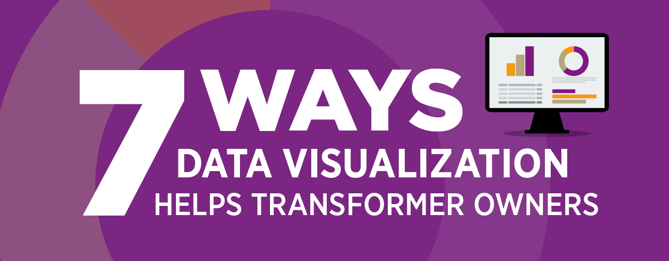
7 Ways Data Visualization Helps Transformer Owners
Everyone can agree that data is essential, and the more, the better, right? Data is collected and analyzed to help us do our jobs better—to make improvements, adjust outcomes, conserve resources, and make informed decisions. However, when we transform data into a visual representation (charts, graphs, reports, or dashboards), we unlock the true power of the data.
Here are seven ways data visualization helps transformer owners.
1. Quick identification of anomalies and fault conditions: By representing data visually, patterns, trends, and anomalies and fault conditions can be easily identified. Users can quickly recognize faults or deviations from normal operating conditions. This enables timely intervention and preventive maintenance before equipment failures or critical downtime occurs.
2. Enhanced situational awareness: Visualization provides a comprehensive overview of equipment health at a glance. Instead of sifting through raw data, decision-makers can grasp the current status and performance of multiple pieces of equipment simultaneously. This improves situational awareness and enables timely decision-making based on accurate insights.
3. Improved data comprehension: Complex data sets related to equipment health, such as test results, maintenance reports, and performance metrics, can be challenging to interpret. Data visualization simplifies this process by transforming raw data into intuitive charts, graphs, and tables. It allows operators, maintenance personnel, and managers to understand the information more effectively, identify patterns, and draw meaningful conclusions.
4. Real-time monitoring and alerts: Visualizations can be designed to provide real-time updates on equipment health. By integrating online condition monitoring data, users can immediately detect faults that could lead to critical events. This facilitates proactive responses with condition-based maintenance, minimizing downtime, and optimizing maintenance strategies.
5. Trend analysis and forecasting: Visualizing historical data enables trend analysis, which is essential for predictive or condition-based maintenance. By plotting data over time, patterns and recurring issues become evident. Such insights can help predict future failures, estimate remaining reliable life, and optimize maintenance schedules. This proactive approach can save time and money and prevent unplanned downtime.
6. Collaboration and communication: Data visualization provides a common visual language for teams involved in equipment monitoring and maintenance. Presenting information in a graphic format makes it easier to share findings, observations, and recommendations with different stakeholders. Visualizations promote effective communication, leading to better collaboration, shared understanding, and more informed decision-making.
7. Performance tracking and optimization: Visual representations of equipment health metrics facilitate performance tracking over time. By comparing current performance with historical data or predefined benchmarks, it becomes possible to assess the effectiveness of maintenance efforts and identify areas for improvement. Visualization enables data-driven optimization by highlighting inefficiencies or trends that might otherwise go unnoticed.
Get Data Visualization with Transformer Dashboard
The primary way SDMyers helps organizations leverage the power of data visualization is with Transformer Dashboard®.
Tops Features of Transformer Dashboard:
- Customizable reports – View reports by detail type or data type, and see summary reports and rainbow reports at the click of a mouse. The dashboard is exceptionally simple and intuitive to use.
- Web-based platform – Access the dashboard from any device with a web browser and internet access. View your inspection and test results in one place, and check how results compare over time.
- Health Center – Color coding summarizes the health of your equipment, so you always know where you stand and can see which transformers pose no threat to your operation, which ones to watch, and which ones are at risk.
- Comparison Tool – This allows you to compare your equipment to similar pieces in your industry and use the comparative data to make maintenance decisions.
- Data Exporting – Exporting allows users within your organization to download your testing data into multiple formats to transfer, share, and analyze data seamlessly.
- Fleetview – If your organization is structured into multiple areas of responsibility, we help you to properly rank each facility or piece of equipment and assign responsibility centers so that alerts, emails, and reports reach the proper contact in the appropriate region automatically.
- Real-time DGA data – Real-time DGA monitoring data from SDMyers’ Guardian Monitoring systems integrate directly into the dashboard to keep asset information in one place.
By leveraging the power of data visualization when it comes to electric power equipment, organizations can unlock insights, identify trends, interpret complex data, and make data-driven decisions more effectively.
Having a dashboard for data visualization tied into your transformer fleet can play a crucial role in monitoring the health of the equipment by presenting complex test results, maintenance history, and real-time condition data in a visual format that is easily understandable and actionable. By harnessing the power of visual data, organizations can make informed decisions, minimize downtime, reduce costs, and maximize the reliability and longevity of their equipment.
Get a Live Demo of Transformer Dashboard
Interested in learning more about Transformer Dashboard? To speak with a transformer specialist about how Transformer Dashboard can help you make intelligent transformer management decisions, contact us for a live demo.
June 27, 2023
 Please wait while logging in.